Rather than a daily condensed or monthly view, add customizable layout options
So someone has already recommended a monthly view, but I would like more options than just this. Google calendar has some great layouts that I use frequently, and I don’t think I can live without them, but it has some downsides. for yoodoo, I’d like to see more layout customization options than what google has:
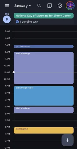
Graph layout
I’d like to have a toggleable option for a graph-like layout similar to what google calendar has
What I love about google, outlook, and apple calendars is that they are structured in a very clear and organized graph format. This helps me to visualize my day better and understand when the things I need to do need to get done. I think there is a lot of value in keeping the blocking options that already exist in the Timeline page, but I think having the option to switch to a graph format would give the best of both worlds.
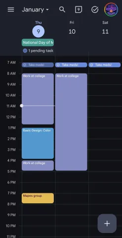
Schedule/Timeline view
This is a mix of the compact view recommendation and what we already have. Currently we can view spaces for a given interval and have the option to add tasks in the designated slots. I think for me, all of the empty add options are a bit cluttered for my brain, but I see the value in having a blocked out day in which there are empty slots to place tasks
I think google calendar does an okay job of the condensed view, but what I’d like to see for yoohoo is more customization than google calendar has.
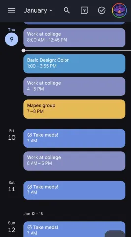
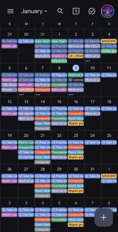
This is google’s schedule layout, a condensed scrolling view that has the whole calendar in one place and you can scroll to any date. I think this is good inspiration, but there are some features I’d like to see. I’d like the option to narrow the timeframe to a specific range, say picking to see a schedule view from 10/4-25/3, or to see just a single day. I’d also like to be able to toggle the empty Add + spaces on or off to make it condensed, as well as keeping the interval options we already have.
1 day, 3 day, work-week, full week, and month
Google calendars' layout is very good in my opinion.
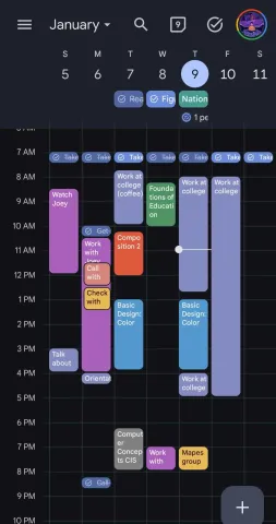
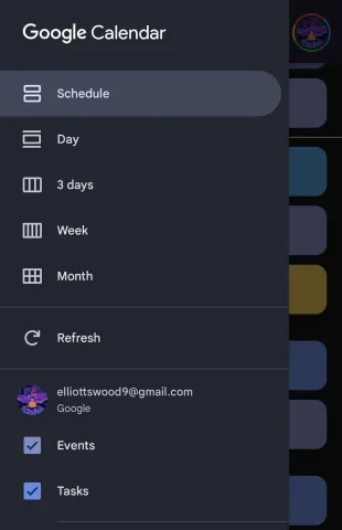
the layout options are a schedule view, a single day, 3 days, a week, and a month. There’s a small button in the top right to seamlessly switch to the task list, another button to take you to the current day, and a search bar. there’s a scrolling side panel to swap between different layouts and manage a few settings. you can click anywhere on the calendar to add an event or task in a block of time, as well as a little plus button at the bottom which does the same thing
Google is Google, they are very good at making things look appealing, but yoodoo has many features this google layout does not have, that’s why you made it, right?
If these options were part of yoodoo, I would have no reason to continue using google calendar other than its synchronization with other apps, and if there is still the option to sync with google calendar, then the reasons to use it get fewer.
I love what you’re doing here man, keep up the great work!
Please authenticate to join the conversation.
In Review
💡 Feature Request
About 1 year ago

Elliott Wood
Subscribe to post
Get notified by email when there are changes.
In Review
💡 Feature Request
About 1 year ago
Elliott Wood
Subscribe to post
Get notified by email when there are changes.